A landing page is simply any page on your website where you expect your website visitors to ‘land’ or visit. With simple websites, the home page of a website also acts as its main landing page. Larger websites may have multiple landing pages – such as a page that details specific product or service offerings, or blog posts. Landing pages must accomplish two main purposes – (i) Generate Traffic: i.e. to make the website discoverable across the internet via search engines, online ads, or social media to attract visitors (ii) Convert Traffic: i.e. help the visitors to take specific actions on your website (often referred to as a ‘conversion’). These ‘conversion actions could be joining your newsletter, purchasing something from you, or contacting you via a form. Creating an eye-catching and high conversion landing page might seem like a herculean task, but with this cheat sheet, you will be rest assured that you don’t miss out on any of the important ingredients.
Even though landing pages share the same goal of increasing conversions, there is no silver bullet that is guaranteed to get results. The design of your landing page depends on a number of factors like your target audience, and your conversion goals.
Having said that, landing pages have now been around for as long as the internet. Over all these years, digital marketers and user behavior researchers have run extensive quantitative and qualitative tests, to understand the most critical elements of a landing page. While creating a landing page is still not an exact science, we can distill down the most important learnings to this cheat sheet.
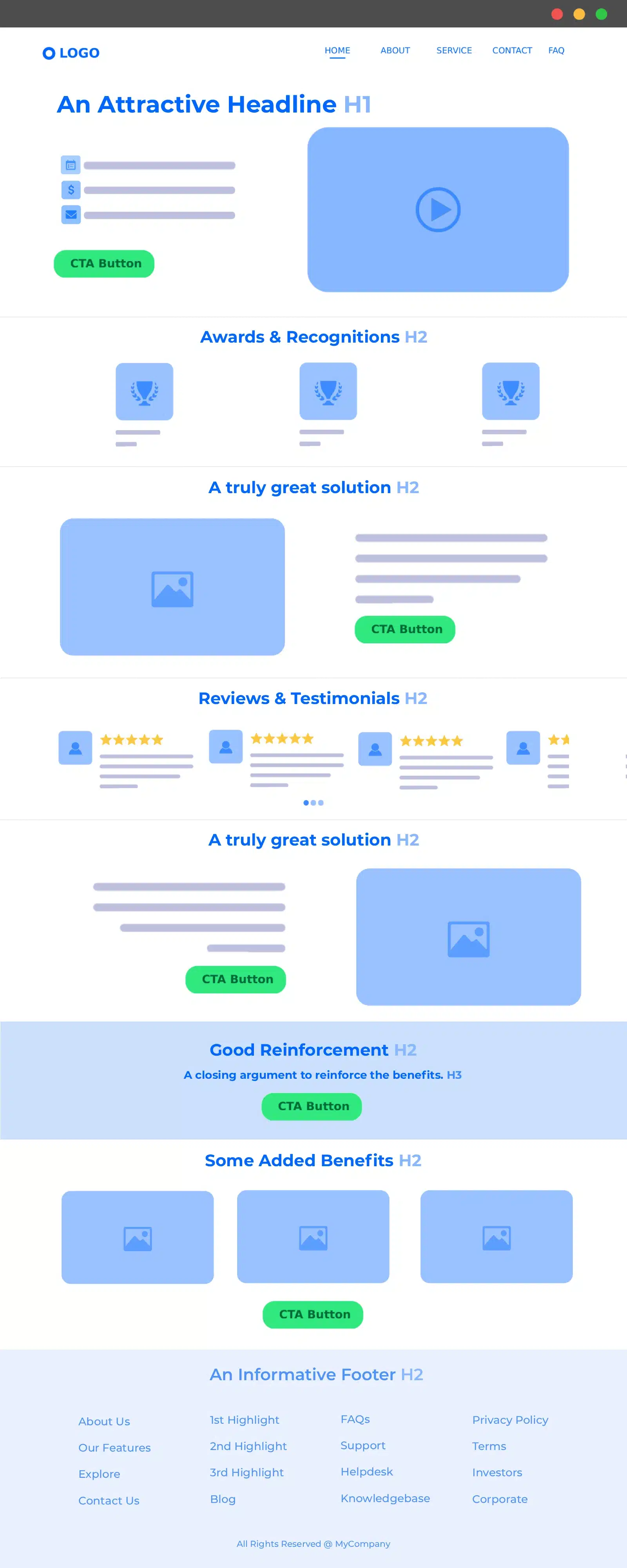
1. A strong ‘Headline’, and a ‘Supporting Headline’
The very first thing visitors will come across when they visit your landing page is the headline – also popularly called the ‘Title text’ or the ‘H1 Title’. It is very important that the headline clearly communicates what you’re offering and why it’s useful to the users, so that users instantly know why they’ve landed on this page. The Headline needs to be concise and catchy, not more than a sentence, ideally less than 10 words and should never exceed 20 words. It is followed by a subheading that highlights what makes your product unique.
Relevancy of the headline is also a major factor to keep in mind. The headline should reflect what it promised when the user clicked on the title, and together with the supporting headline, should offer a solution to their problem.
2. Your Unique Selling Point (USP)
The Unique Selling Point is a short description that explains what makes your offering special. Through the USP, you establish the point of differentiation that sets you apart from the crowd. The digital business landscape is incredibly competitive, so customers would want to choose the best solution out there. Your USP should convince customers to do business with you instead of one of your competitors.
A good USP should be:
– clear and concise: easy for prospective customers to understand,
– define your target market,
– highlights the benefits of your product.
3. A clear Call-to-Action (CTA) button that stands out
The entire purpose of your landing page is to direct people to your call-to action. It is a short phrase, usually embedded in a clickable text phrase, image, or button, that encourages site visitors to take immediate action and perform a certain task. Action oriented language like Download Now, Limited Time Offer, Avail Now makes it easier for visitors to take action. It is the finish line of your landing page. It might be downloading a file, signing up as members, subscribing to a service or purchasing a product.
There are some things that you should keep in mind while designing your CTA that makes it more likely to attract visitors. It should be made visible and eye-catching, by using bright and contrasting colors that makes your CTA stand out in your landing page. Be imaginative with your CTA text, using uninspiring language in your CTA is not going to look good on your landing page. The location and proportion of your CTA also impacts its performance in a major way. The CTA should be proportionate to the rest of UI elements in your landing page, and should reflect its unique role in your site. Your CTA should also give visitors a data privacy assurance, so that they can trust you with their personal data.
4. Social proof
In today’s incredibly competitive digital marketing space, consumers have endless choices for similar kinds of products. Adding social proof like testimonials and reviews adds credibility to the product or service you’re offering through your landing page. It erases any doubts regarding the legitimacy of your offer and provides users peace-of-mind.
Reviews are a deciding factor in whether a customer takes action or not, and have the potential to make or break a business. Reading about the experiences of actual people and companies directly impacts buying decisions. As such, it is very important to implement a section to establish social proof through reviews, testimonials, usage statistics, and trust badges in your landing page. Adding your contact details on your landing page is another good example.
5. Engaging and persuasive copy
Your landing page copy is simply the bodies of text on your landing page. Your copy should be convincing enough to persuade visitors to take further action. It usually follows on directly from your USP, and provides a more detailed description of the benefits of your offerings. A clear and concise explanation of what your product can do, highlighting its benefits and features are the basic requirements to keep in mind while writing the copy of your site. Elements necessary to write an engaging copy include:
– careful usage of words, text that fit in well with your brand’s tone of voice,
– should mention how your product intends to add value to the user’s life,
– should describe the problem you are solving,
– should include a benefit summary,
– should neither be too verbose nor too cryptic ,
– should (optionally) create a sense of urgency for the user to act (example: “only 14 copies left”).
6. Add visual appeal through imagery and media
Liven up the aesthetic of your landing page by using attention-grabbing images and media that depicts the product you’re offering. Using images and illustrations also serves the purpose of breaking up the look for a more organized visual structure. While choosing the imagery to put on your landing site, consider only what’s appropriate for your target audience, so that the visuals reflect their interests. Depending on your goals and interests, you might add videos, graphics or charts.
Along with enhancing the visual experience of your site, using imagery and media improves overall engagement by giving directional cues that point a visitor towards your call-to-action. Most users are familiar with having streaming videos on websites. Don’t be afraid to embed an explainer video or two.
7. Create a good Reinforcement statement
The Reinforcing statement is a kind of a page title that is placed about halfway down your page and serves the purpose of communicating a mid-experience message to your customers and visitors, and reinforces the main headline. When readers scroll through your page, the reinforcing statement jumps out at them and reinforces their notion of why they should be considering your product instead of your competitors. It works as an extra headline and has a significant impact on the purchase decision for the viewers.
8. A Closing argument
The closing argument is used on longer pages. It is your final chance to remind your visitors once again why your visitors should be picking your product or offering. A closing argument should not be used if your landing page is above the fold and your main headline is still in sight.
9. Adding a confirmation page
To add a layer of hospitality to your landing page, add a confirmation page visitors are greeted with once they have completed the action that was intended. This page should thank them for taking action, and can be used to redirect customers to your social media channels.
10. Remove distractions
While designing your landing page, keep in mind that the conversion of visitors to leads is the sole aim of the page. Refrain from adding links to other sections of your website in your landing page. It is a good practice to keep the landing page clean and minimal, so that the important parts stand out, and don’t get lost in a maze of unnecessary elements. A simple landing page with a unified and cohesive look generates more leads than a site crammed with information.
Conclusion
Creating quality landing pages for each campaign or offer will be a major part of your lead generation strategy. A well-made landing page helps your website get higher conversions, increases its organic and SEO reach, and can massively help in promoting an upcoming product or sale. It provides additional insights into your target audience and boosts user engagement in your business. Use this cheat sheet to guide you while you build the best landing pages for your business and grab every lead you can.
Build your own landing page?
With WordPress’s inbuilt blocks page builder, you can build your landing page without needing to code. Get started today and launch your WordPress website on Hustly in one click. With our 30 day free trial and liberal refund policy, you have nothing to lose.
![]()